Bron: blog van Jeff Masters op wunderground, link onderaan. Meer uitleg voor de figuren: zie daar.
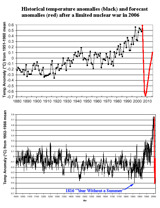
Global average temperature departure from normal since 1880 (top) and A.D. 1000 (bottom) in black, and those projected after a limited nuclear exchange between Pakistan and India of 100 Hiroshima-sized weapons in 2006 (in red). Temperatures are forecast to plunge 1.2°C (2.2°F) after such a war, reaching levels colder than anything seen in the past 1000 years. The 1815 eruption of Tambora in Indonesia produced a similar cooling, and led to the notorious "Year Without a Summer". Image credit: "Climatic consequences of a regional nuclear conflict" by Robock et al., Atmospheric chemistry and Physics, 7, 2003-2012, 2007
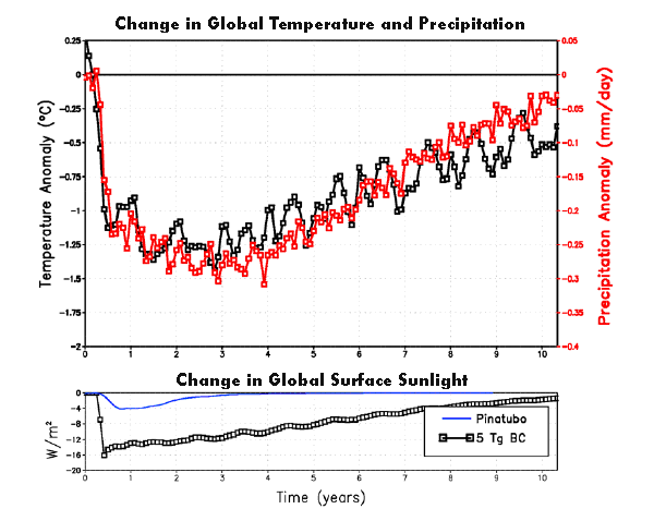
Top: Time variation of global average surface air temperature and precipitation for a limited nuclear exchange between Pakistan and India of 100 Hiroshima-sized weapons, assuming they inject 5 Tg of Black Carbon (BC) into the stratosphere. The global average precipitation is 3 mm/yr, so the changes in years 2-4 represent a 9% global average reduction in precipitation. Bottom: Time variation of sunlight (shortwave radiation) at the surface, in watts per meter squared, due to the 1991 eruption of Mt. Pinatubo in the Philippines (blue line) and the limited nuclear war between India and Pakistan (black line). The effects of a limited nuclear war are far more severe and long lasting than the eruption of Pinatubo, the greatest eruption of the 20th century. Image credit: "Climatic consequences of a regional nuclear conflict" by Robock et al., Atmospheric chemistry and Physics, 7, 2003-2012, 2007
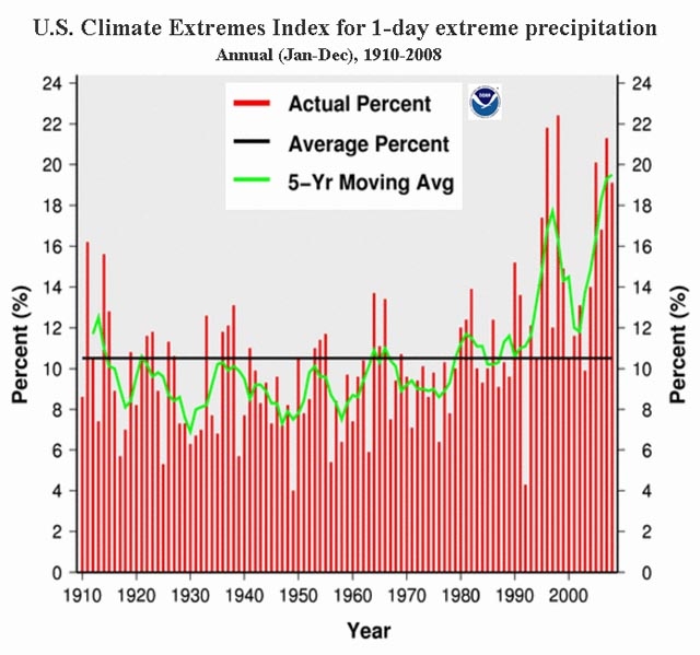
The Annual Climate Extremes Index (CEI) for heavy 1-day precipitation events shows that these events, on average, have affected 10% of the U.S. over the past century (black line). However, heavy precipitation events have increased recently, with seven of the top ten years on record having occurred since 1995. Image credit: National Climatic Data Center.
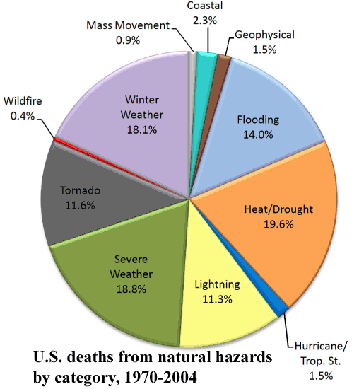
U.S. deaths due to natural hazards between 1970 and 2004 showed that weather associated with extremes of hot and cold weather, along with severe thunderstorm winds (the "Severe Weather" category), killed the most people. Image credit: Spatial patterns of natural hazards mortality in the United States, International Journal of Health Geographics. Authors: Kevin Borden and Susan Cutter of the University of South Carolina.
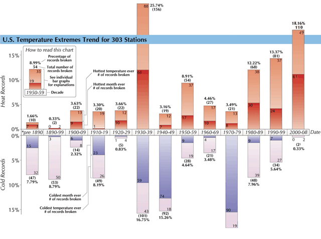
Minimum and maximum temperatures records for the U.S. for 303 major stations. The image has been updated through January 2009 to include the one record low set that month. The original version of this image was for 2007, and I modified it to update it for four changes made in the 2008 data. The numbers for the decade of the 2000s are correct, but there are four (out of 606) records that need to be subtracted off some of the earlier decades. Note the the 1930s were the most extreme decade for total number of records set, but the 1920s were the least extreme. U.S. weather has a high degree of variability from decade to decade. Image credit: Chris Burt, Extreme Weather.
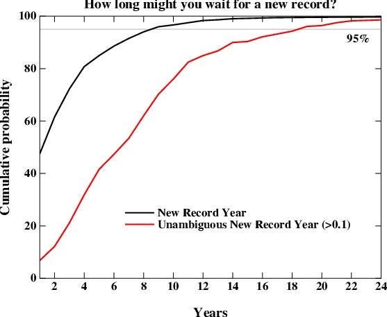
Cumulative distribution of how long one would have to wait for a new global temperature record to be set between the years 1990 and 2030. Image is based on the twenty climate models used to formulate the 2007 IPCC report, using the A1B "business as usual" scenario. The curves should be read as the percentage chance of seeing a new record (Y axis) if you waited the number of years on the X axis. The two curves are for a new record of any size (black) and for an unambiguous record (> 0.1°C above the previous record, red). The 95% confidence line is marked in gray. The main result is that 95% of the time, a new record will be seen within 8 years, but that for an unambiguous record, you need to wait for 18 years to have similar confidence. Image credit: Realclimate.org.
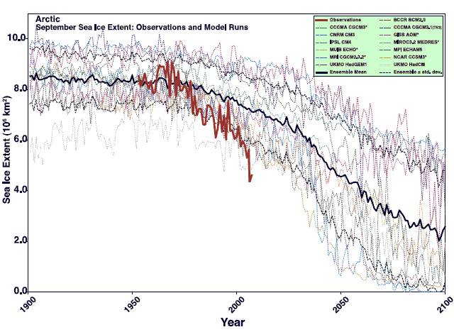
Arctic sea ice extent from observations (thick orange line) and 13 model forecasts used to formulate the 2007 IPCC report (light lines). The thick black line is the multi-model ensemble mean, with the standard deviation plotted as a dashed black line. Image has been updated to include the observed 2007 and 2008 measurements. Image credit: Arctic sea ice decline: Faster than forecast by Stroeve et al., 2007.
Groeten,
Wouter
Global average temperature departure from normal since 1880 (top) and A.D. 1000 (bottom) in black, and those projected after a limited nuclear exchange between Pakistan and India of 100 Hiroshima-sized weapons in 2006 (in red). Temperatures are forecast to plunge 1.2°C (2.2°F) after such a war, reaching levels colder than anything seen in the past 1000 years. The 1815 eruption of Tambora in Indonesia produced a similar cooling, and led to the notorious "Year Without a Summer". Image credit: "Climatic consequences of a regional nuclear conflict" by Robock et al., Atmospheric chemistry and Physics, 7, 2003-2012, 2007
Top: Time variation of global average surface air temperature and precipitation for a limited nuclear exchange between Pakistan and India of 100 Hiroshima-sized weapons, assuming they inject 5 Tg of Black Carbon (BC) into the stratosphere. The global average precipitation is 3 mm/yr, so the changes in years 2-4 represent a 9% global average reduction in precipitation. Bottom: Time variation of sunlight (shortwave radiation) at the surface, in watts per meter squared, due to the 1991 eruption of Mt. Pinatubo in the Philippines (blue line) and the limited nuclear war between India and Pakistan (black line). The effects of a limited nuclear war are far more severe and long lasting than the eruption of Pinatubo, the greatest eruption of the 20th century. Image credit: "Climatic consequences of a regional nuclear conflict" by Robock et al., Atmospheric chemistry and Physics, 7, 2003-2012, 2007
The Annual Climate Extremes Index (CEI) for heavy 1-day precipitation events shows that these events, on average, have affected 10% of the U.S. over the past century (black line). However, heavy precipitation events have increased recently, with seven of the top ten years on record having occurred since 1995. Image credit: National Climatic Data Center.
U.S. deaths due to natural hazards between 1970 and 2004 showed that weather associated with extremes of hot and cold weather, along with severe thunderstorm winds (the "Severe Weather" category), killed the most people. Image credit: Spatial patterns of natural hazards mortality in the United States, International Journal of Health Geographics. Authors: Kevin Borden and Susan Cutter of the University of South Carolina.
Minimum and maximum temperatures records for the U.S. for 303 major stations. The image has been updated through January 2009 to include the one record low set that month. The original version of this image was for 2007, and I modified it to update it for four changes made in the 2008 data. The numbers for the decade of the 2000s are correct, but there are four (out of 606) records that need to be subtracted off some of the earlier decades. Note the the 1930s were the most extreme decade for total number of records set, but the 1920s were the least extreme. U.S. weather has a high degree of variability from decade to decade. Image credit: Chris Burt, Extreme Weather.
Cumulative distribution of how long one would have to wait for a new global temperature record to be set between the years 1990 and 2030. Image is based on the twenty climate models used to formulate the 2007 IPCC report, using the A1B "business as usual" scenario. The curves should be read as the percentage chance of seeing a new record (Y axis) if you waited the number of years on the X axis. The two curves are for a new record of any size (black) and for an unambiguous record (> 0.1°C above the previous record, red). The 95% confidence line is marked in gray. The main result is that 95% of the time, a new record will be seen within 8 years, but that for an unambiguous record, you need to wait for 18 years to have similar confidence. Image credit: Realclimate.org.
Arctic sea ice extent from observations (thick orange line) and 13 model forecasts used to formulate the 2007 IPCC report (light lines). The thick black line is the multi-model ensemble mean, with the standard deviation plotted as a dashed black line. Image has been updated to include the observed 2007 and 2008 measurements. Image credit: Arctic sea ice decline: Faster than forecast by Stroeve et al., 2007.
Groeten,
Wouter
